Dark Sanctuary
The complete design system for Travel Tamers. A premium, dark-mode-first aesthetic inspired by private members' lounges — deep navy backgrounds, warm off-white text, and restrained gold accents. Built for tech executives who value sophistication over flash.
Overview
"Dark Sanctuary" is the design language for Travel Tamers, a premium travel concierge service powered by Nexion Travel Group. The system targets tech executives at mid-size companies (51-200 employees) who are Slack-native and expect polished, high-end digital experiences.
The visual direction draws from the atmosphere of an exclusive members' lounge: dark, warm, and confident. Every design decision follows the 60-30-10 rule — 60% dark foundation colors, 30% text and structural elements, and 10% gold accent for emphasis and action.
Core Principles: Dark-mode-first design. No pure white (#FFF) or pure black (#000). Gold is always flat/matte, never in saturated gradients. Maximum two accent colors per page section. Typography creates hierarchy through weight and scale, not color variation.
Tech Stack
| Layer | Tool | Role |
|---|---|---|
| CSS Framework | Tailwind CSS 4 | Utility-first styling with @theme tokens |
| Fonts | Playfair Display + Source Sans 3 | Self-hosted variable WOFF2 in public/fonts/, weight 400-700, font-display: swap. No Google Fonts CDN. |
| Animations | GSAP | Scroll-triggered animations, page transitions |
| Icons | Lucide (Nexus only) + custom SVGs | UI icons, feature illustrations (lucide-react removed from marketing site) |
| Images | Unsplash + optimized assets | Hero backgrounds, destination photography — curated and color-graded for the dark palette |
| Search | Pagefind | Static site search indexing |
File Locations
| File | Purpose |
|---|---|
site/src/styles/global.css | Master design tokens (@theme block, 1000+ lines) |
site/public/fonts/ | Self-hosted WOFF2 variable font files (Playfair Display + Source Sans 3) |
architecture/design-system.md | Full specification document |
site/src/components/*.astro | Astro component implementations |
Color System
Colors follow a strict 60-30-10 distribution. The foundation palette occupies 60% of any page, text and structure fill 30%, and accent gold touches the remaining 10%. Never use pure white or pure black.
Foundation (60%) — Backgrounds & Surfaces
Deep Navy (Abyss 800) #0B1120 Midnight #0F2440 Deep Current (Abyss 600) #131B2E Ink Wash (Abyss 500) #1A2540 Blue Ghost #162A45Text & Structure (30%)
Cloud (Primary Text) #F0EDE8 Mist (Secondary Text) #8B95A5 Slate Line (Borders) #1E3050Accent (10%) — Action & Emphasis
Gold (Primary Accent) #C9A84C Brass (Warm Gold / Hover) #E8B83D Ocean Blue (Secondary) #2E86AB Sky Blue (Teal Light) #5BA4C9Semantic — Status & Feedback
Danger #A85454 Success #4A8B6A Error #C75B4A Warning (reuses Gold) #E8B83DSurface Tints — Light Section Backgrounds
Tint Blue #F0F6F9 Parchment #F4F2EE Success BG #EBF5EE Warm White #FBF7F060-30-10 Rule: 60% Foundation (
abyss-800page bg,abyss-600cards,abyss-500hover surfaces). 30% Text/Structure (cloudheadlines,mistsecondary text,slate-lineborders). 10% Accent (goldfor primary CTAs and links,tealfor secondary actions).
Gold Color Correction: The canonical gold accent is
#C9A84C, but several subsystems (Pagefind search highlights, Groups app) previously used this value where the warmer#E8B83D(Brass) was needed for visibility. These have been corrected to#E8B83Dthroughout Pagefind and the Groups app.
Typography
Two typeface families create clear hierarchy. Playfair Display (serif) provides a luxury editorial feel for headlines, while Source Sans 3 (sans-serif) ensures excellent readability for body content, UI elements, and long-form reading.
Display Font
Playfair Display
Used for all headings (h1-h3), hero text, and feature titles. Conveys timelessness and editorial quality. Self-hosted as a variable WOFF2 file with weight range 400-700, including italic.
The world is a book, and those who do not travel read only one page.
Body Font
Source Sans 3
Used for body text, navigation, buttons, labels, and all UI elements. Loaded at weights 300-700. Optimized for screen readability at small sizes.
We craft unforgettable journeys for technology leaders who value their time above all else. Every detail is handled, every experience curated, every moment designed to restore and inspire.
Self-Hosted Font Loading
Both font families are self-hosted as WOFF2 variable font files in
site/public/fonts/. There are no Google Fonts CDN links anywhere in the codebase.
The @font-face declarations use font-display: swap for fast initial
render with fallback fonts (Georgia/serif for display, system-ui/sans-serif for body). The
@theme block in global.css registers them as --font-display
(Playfair Display) and --font-body (Source Sans 3).
| Font | Format | Weight Range | Styles |
|---|---|---|---|
| Playfair Display | WOFF2 Variable | 400-700 | Normal + Italic |
| Source Sans 3 | WOFF2 Variable | 300-700 | Normal |
Type Scale
display-2xl4.5rem / 72px Travel Redefined display-xl
3.75rem / 60px Premium Journeys display-lg
3rem / 48px Section Heading display-md
2.25rem / 36px Subsection Title display-sm
1.875rem / 30px Card Heading body-lg
1.125rem / 18px Lead paragraph text for introductions and emphasis. body
1rem / 16px Standard body text for reading and general content. caption
0.875rem / 14px Secondary text, captions, and supporting details. label
0.75rem / 12px UPPERCASE LABELS AND CATEGORY TAGS
Spacing & Layout
Spacing uses a consistent scale tied to section rhythm. The layout features a distinctive graph paper background with a dual-grid pattern that adds subtle depth to the dark foundation.
Section Spacing Scale
| Token | Value | Usage |
|---|---|---|
section-sm | 3rem (48px) | Mobile section padding |
section-md | 5rem (80px) | Tablet section padding |
section-lg | 7.5rem (120px) | Desktop section padding |
section-xl | 10rem (160px) | Generous desktop spacing |
nav-height | 4rem (64px) | Default navigation bar height |
nav-compact | 3rem (48px) | Scrolled/compact nav state |
Content Max Widths
| Token | Value | Usage |
|---|---|---|
content | 42.5rem (680px) | Body text (65-75 char line length) |
section | 80rem (1280px) | Content sections with grids |
wide | 87.5rem (1400px) | Wide sections, card grids |
full-bleed | 100rem (1600px) | Hero images, full-width sections |
Graph Paper Background
The site uses a dual-grid background with two layers of lines —
a 28px minor grid and a 112px major grid — creating a subtle graph paper texture.
A radial vignette fades the grid at the edges, and background-attachment: fixed
keeps the pattern stationary during scroll for a parallax-like depth effect.
On mobile (devices without hover capability), background-attachment: fixed is
disabled via a @media (hover: hover) query to prevent rendering issues on iOS/Android.
/* Dual-grid graph paper */
background-image:
  linear-gradient(rgba(42,53,80,0.15) 1px, transparent 1px),  /* minor horizontal */
  linear-gradient(90deg, rgba(42,53,80,0.15) 1px, transparent 1px),  /* minor vertical */
  linear-gradient(rgba(42,53,80,0.3) 1px, transparent 1px),   /* major horizontal */
  linear-gradient(90deg, rgba(42,53,80,0.3) 1px, transparent 1px);  /* major vertical */
background-size: 28px 28px, 28px 28px, 112px 112px, 112px 112px;
background-attachment: fixed;
Shadow System
| Level | Token | Usage |
|---|---|---|
| Rest | shadow-rest | Default card state, subtle depth |
| Hover | shadow-hover | Interactive hover elevation |
| Elevated | shadow-elevated | Dropdowns, popovers |
| Modal | shadow-modal | Modals, dialogs |
| Gold Glow | shadow-gold-glow | Gold accent elements (CTAs, FAB) |
Border Radius Scale
| Token | Value | Usage |
|---|---|---|
radius-sm | 0.25rem (4px) | Subtle rounding, code blocks |
radius-DEFAULT | 0.5rem (8px) | Standard buttons, inputs |
radius-md | 0.75rem (12px) | Cards, panels |
radius-lg | 1rem (16px) | Modals, large containers |
radius-xl | 1.5rem (24px) | Feature cards, hero elements |
radius-pill | 9999px | Pill buttons, badges, chat FAB |
Component Library
All components follow Dark Sanctuary tokens. Key Astro components live in
site/src/components/ and render as static HTML with optional React islands
for interactivity.
Cards (card-depth system)
All cards use the unified card-depth class (replacing the older card-hover),
which provides abyss-600 background, slate-line border, 12px radius, and
consistent hover behavior (border lightens, card lifts with increased shadow). Clickable cards include
focus-visible outline rings for keyboard accessibility. Non-clickable cards like
FeatureCard have hover effects removed to avoid false affordances. StatCard
glass effects have been removed to prevent double-shadow artifacts. All card components also receive
the Elemental Design System layers (see below).
Featured
7 Nights
Santorini Escape
Private villa, sunset catamaran cruise, and vineyard tour on the caldera.
Experience ImageAdventure
Patagonia Trek
Guided wilderness expedition with luxury lodge accommodations.
Badges
Small pill-shaped labels for categorization and status indicators.
Gold Badge
Teal Badge
Success
Danger
Neutral
Callouts
Bordered left-accent boxes for tips, warnings, and important information.
Default callout with gold left border — used for general tips and highlights.
Info callout with teal left border — used for technical notes and references.
Warning callout with danger-red left border — used for cautions and breaking changes.
Success callout with green left border — used for confirmations and best practices.
Navigation
The main site nav uses a fixed top bar with backdrop-blur glass effect over the
dark background. Nav height is 4rem (64px) default, collapsing to 3rem (48px) on scroll.
The primary CTA button sits in the top-right corner.
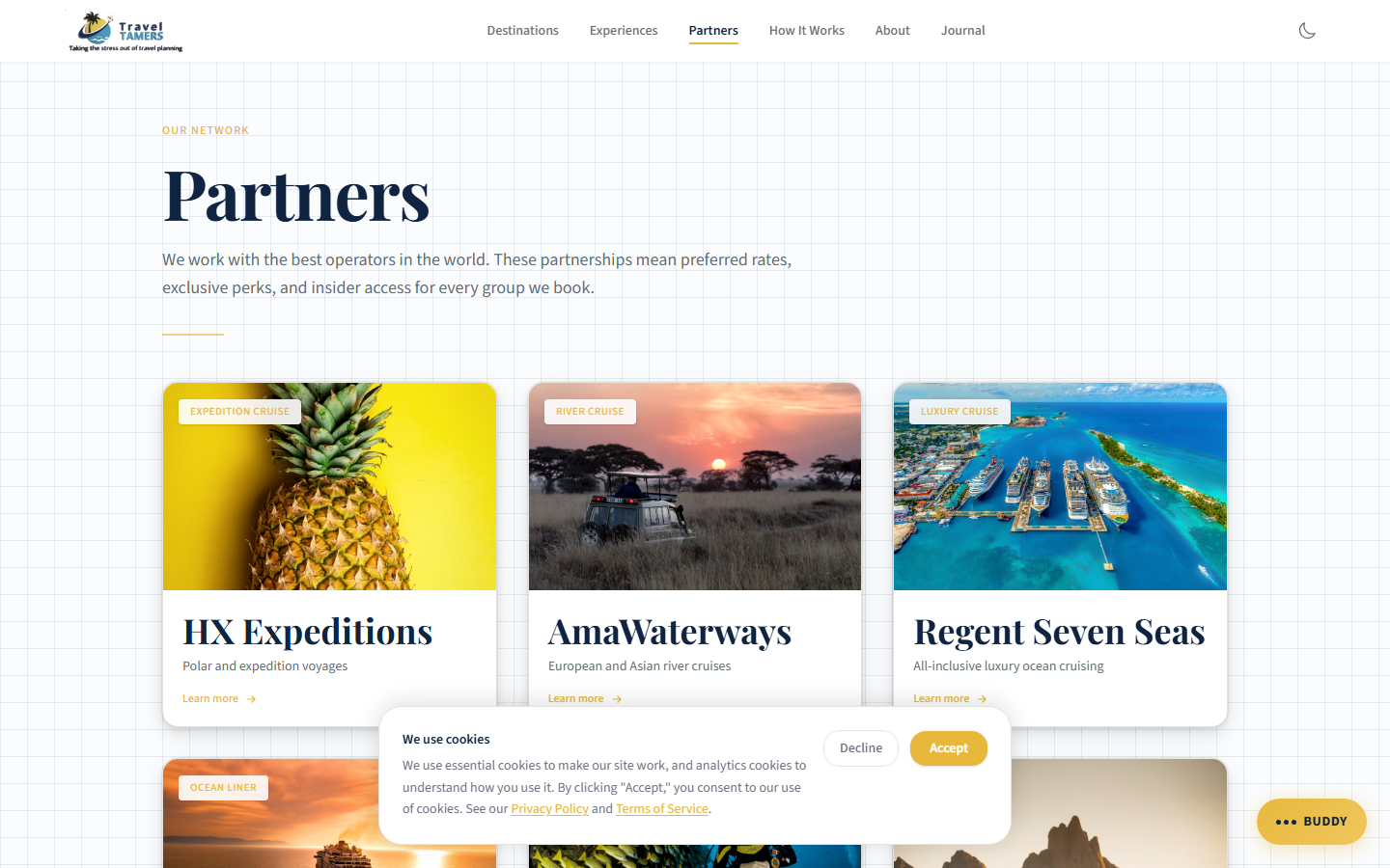
Partner Logos
All 9 partner cards display partner logos on their card faces, sized between 32px and 80px height
depending on each partner's logoScale value. Logos are stored as optimized images in
the content collection and rendered with object-fit: contain for consistent presentation
regardless of aspect ratio. On partner detail page heroes, logos are displayed with a CSS
invert filter so they remain legible against the dark overlay.
Astro Components
| Component | File | Description |
|---|---|---|
| Nav | Nav.astro | Fixed navigation with glass blur, CTA button |
| Footer | Footer.astro | Site-wide footer with link columns |
| Section | Section.astro | Reusable section wrapper with spacing props |
| DestinationCard | DestinationCard.astro | Image card with overlay text, elemental layers |
| ExperienceCard | ExperienceCard.astro | Feature card for curated experiences, elemental layers |
| TestimonialCard | TestimonialCard.astro | Client quote with attribution, elemental layers |
| StatCard | StatCard.astro | Animated stat number with label, elemental layers |
| FeatureCard | FeatureCard.astro | Icon + title + description layout, elemental layers |
| BlogPostCard | BlogPostCard.astro | Blog listing card with date and category, elemental layers |
| PartnerCard | PartnerCard.astro | Partner logo card (32-80px logo height), elemental layers |
| WaveDivider | WaveDivider.astro | SVG wave separator between sections |
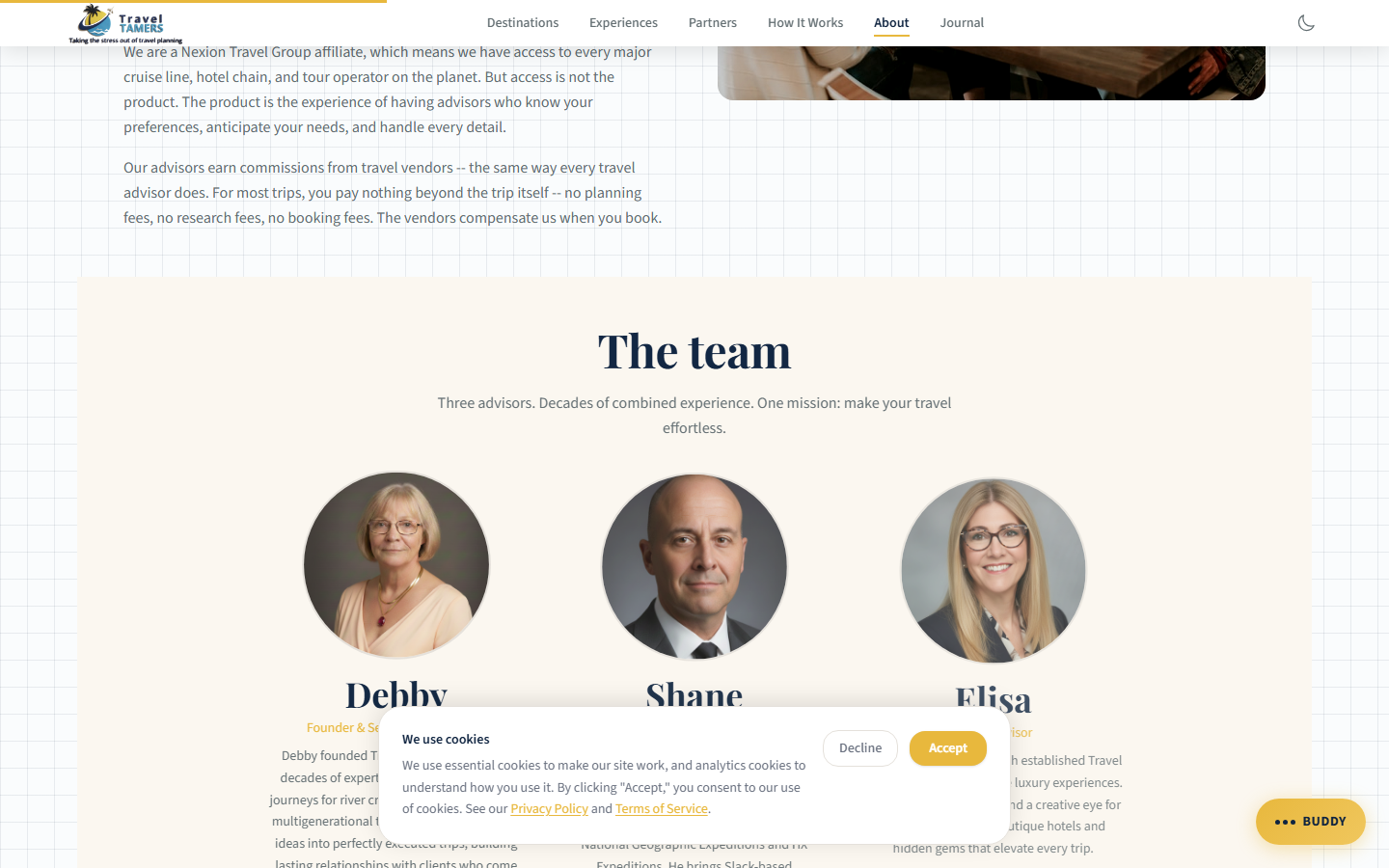
| TeamMemberCard | TeamMemberCard.astro | Team bio card with photo and role |
Dark Mode (React Islands)
React islands that render on both light and dark sections have been audited for dark mode
compatibility. Each component uses dark: Tailwind variants to match the Dark Sanctuary
palette when embedded in dark sections.
| Component | Dark Variants | Key Changes |
|---|---|---|
ContactForm | 11 | Input backgrounds, border colors, label text, role="alert" on errors |
OnboardingForm | 32 | Multi-step form panels, progress bar, radio groups, 35+ htmlFor/id pairs |
NewsletterSignup | 5 | Input field, placeholder, button hover state, role="status"/role="alert" |
Accordion | 3 | Border, hover background, expanded state |
Elemental Design System
The Elemental Design System adds tactile, physical-world texture to the Dark Sanctuary palette through four material layers: Paper, Water, Metal, and Fire. Each layer contributes subtle visual cues that reinforce the premium lounge atmosphere without overwhelming the core dark/gold aesthetic. All four elements have automatic dark mode inversions.
📜Applied to: All card components (DestinationCard, ExperienceCard, BlogPostCard, PartnerCard, FeatureCard, TestimonialCard, StatCard) and Accordion items receive elemental layers. The layers are additive — a single component can combine multiple elements.
Paper
Adds organic texture through an SVG noise grain overlay. The elemental-paper class
applies a tiled SVG noise pattern at 8% opacity with multiply blend mode,
giving surfaces a handmade, slightly rough feel — like premium stationery.
| Class | Effect |
|---|---|
elemental-paper | SVG noise grain overlay (8% opacity, multiply blend) |
Dark mode: Blend mode switches to
screen so the grain reads as light speckles on dark surfaces.
Water
Brings fluid, aquatic depth through teal-tinted effects. Water classes create a sense of depth and calm, reinforcing the ocean/travel theme.
| Class | Effect |
|---|---|
card-depth-water | Teal underglow in hover shadows |
section-water-mist | Gradient veil overlay for section backgrounds |
water-glass | Frosted glass panel effect |
Input focus states receive a teal ring. Dark mode: Water shifts to an abyssal teal — deeper, cooler tones that evoke deep ocean.
⚙Metal
Provides refined, polished surfaces with gold-tinted metallic effects. Metal classes add a sense of craftsmanship and luxury hardware.
| Class | Effect |
|---|---|
metal-etched | Gold-tinted border treatment |
metal-polish | Hover border flare — border brightens on interaction |
metal-shine | Specular sweep — a light glint that moves across the surface |
btn-forged | Gradient button with hammered-metal look |
Dark mode: Metal becomes molten teal — borders shift from gold tint to a cooler teal metallic.
🔥Fire
Communicates urgency and attention through warm, ember-like effects. Fire classes are used sparingly for warnings, errors, and time-sensitive states.
| Class | Effect |
|---|---|
fire-advisory | Warning card with ember glow border |
ember-pulse | Pulsing animation — a slow, breathing glow |
fire-heat | Hover intensification — warmth increases on interaction |
fire-validation | Error state styling for form inputs |
Dark mode: Fire becomes smoldering — reduced intensity with deeper ember tones to avoid overwhelming the dark palette.
Dark Mode Inversions
Each element has a corresponding dark mode transformation that preserves the intent while matching the Dark Sanctuary palette:
| Element | Light Mode | Dark Mode |
|---|---|---|
| Paper | Multiply blend (dark speckles on light) | Screen blend (light speckles on dark) |
| Water | Standard teal glow and frost | Abyssal teal — deeper, cooler ocean tones |
| Metal | Gold-tinted metallic borders | Molten teal — cooler metallic sheen |
| Fire | Bright ember glow and warmth | Smoldering — subdued, deep ember tones |
Dark Mode System
The site implements a comprehensive 3-way theme toggle (light / dark / system)
in Nav.astro using sun, moon, and monitor icons. The selected preference is persisted
in localStorage under the tt_theme key.
Flash Prevention
A script in BaseLayout.astro's <head> reads tt_theme
from localStorage before first paint and applies html.dark immediately. When set to
"system", it checks prefers-color-scheme. The dark-mode.js script manages
the toggle interaction and includes a prefers-color-scheme media query listener for
real-time OS theme changes in system mode.
Token Override Approach
Tailwind 4 custom classes defined in the @theme block (e.g., .text-navy,
.bg-white) are not covered by Tailwind's built-in dark:
prefix because they are custom utilities, not standard Tailwind classes. To handle this, 25+ token
overrides in global.css flip these classes under html.dark, covering
2,000+ class instances across the site without touching individual templates:
| Category | Overrides | Purpose |
|---|---|---|
| Text | .text-navy, .text-charcoal, .text-warm-gray, .hover\:text-navy | Flip dark text colors to light equivalents |
| Arbitrary text | .text-[#2D3436], .text-[#374151], .text-[#4B5563], .text-[#1F2937] | Body and component dark hex text → light |
| Backgrounds | .bg-white → #131B2E, .bg-parchment → #151D30, .bg-tint-blue, .bg-white/90, .bg-sky-50, .bg-gold-50 | Light surfaces → dark card depth |
| Arbitrary bgs | .bg-[#F4F2EE], .bg-[#ffffff], .bg-[#F0F6F9] | Hex cream/white backgrounds → dark |
| Gradients | .from-white, .to-white, .from-[#F0EDE8], .to-transparent | White gradients → dark gradients |
| Borders | .border-light-border, .bg-light-border, .divide-[#E5E1DB], .border-parchment-border | Light borders → slate dividers |
Additional Dark Mode Rules
- Pagefind search: Custom CSS variables override Pagefind's default styling (dark input, dark dropdown, gold highlights)
- btn-secondary on dark sections: Safety overrides for visibility on
bg-abyss-600/bg-abyss-800 - Cookie consent: Explicit
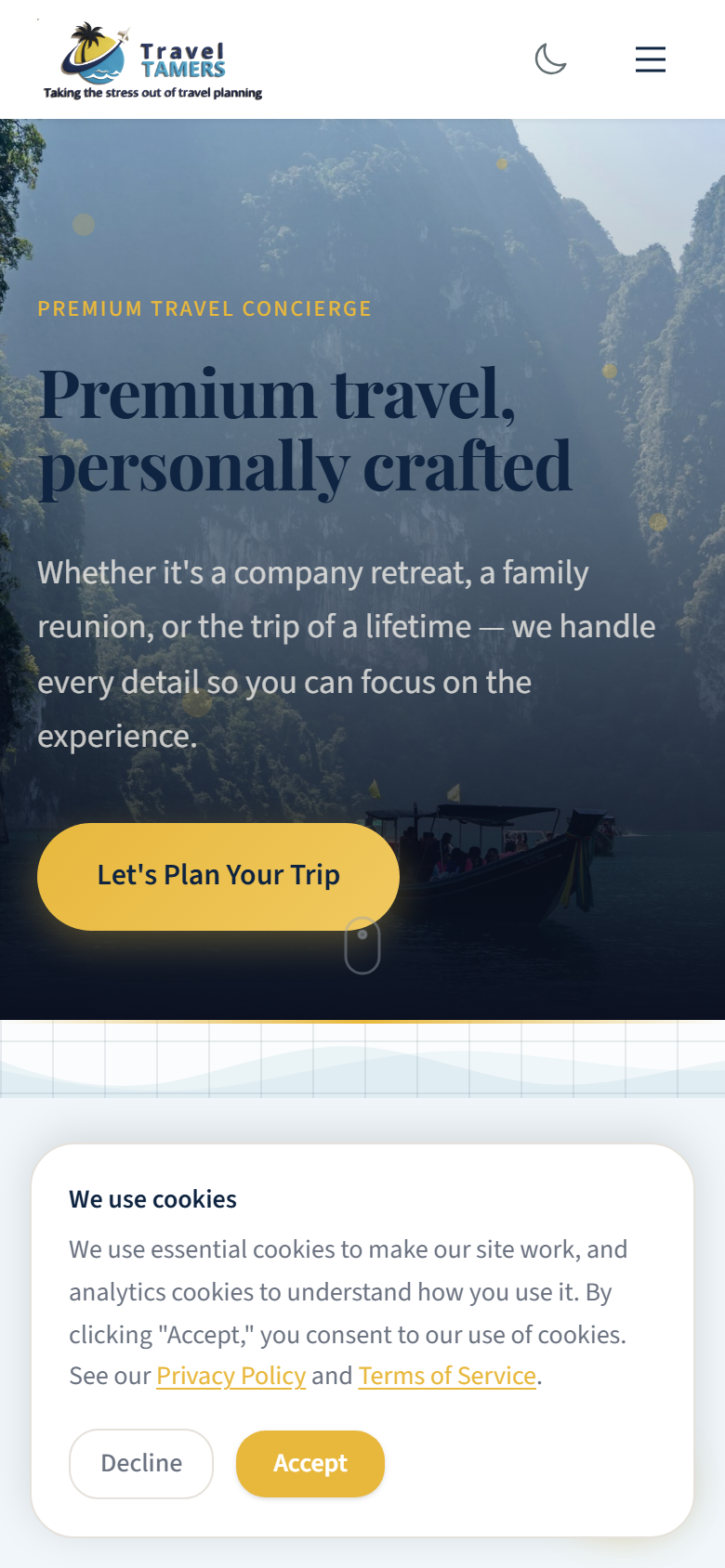
dark:classes on heading, body text, and decline button (can't use global override fortext-[#0F2440]since it's also used on gold badge backgrounds where dark text is correct) - Footer: Dark mode overrides removed since footer is always on a dark background
- font-serif text-stroke: Disabled in dark mode to prevent visual artifacts
- prose-invert: Removed from 6 locations where it was applied on light backgrounds
Why token overrides? Tailwind's
dark:prefix works for standard utilities likedark:text-white. But custom tokens like.text-navy(defined via@theme { --color-navy: #0F2440 }) don't get automatic dark variants. The 25+ overrides solve this at the CSS level, avoiding the need to adddark:classes to 2,000+ template locations.
Responsive Breakpoints
Tailwind 4 breakpoints are defined in the @theme block. The design is
mobile-first — base styles target phones, then progressively enhance at each breakpoint.
| Token | Min Width | Target | Columns |
|---|---|---|---|
base |
0px | Small phones | 1 column |
sm |
640px | Large phones / landscape | 1-2 columns |
md |
768px | Tablet portrait | 2 columns |
lg |
1024px | Tablet landscape / small desktop | 3 columns |
xl |
1280px | Desktop | 3-4 columns |
2xl |
1536px | Wide desktop | 4 columns |
Responsive Typography
| Element | Mobile | Desktop |
|---|---|---|
| h1 (Page Hero) | 2.25rem (36px) | 4.5rem (72px) |
| h2 (Section Title) | 1.875rem (30px) | 3rem (48px) |
| h3 (Subsection) | 1.5rem (24px) | 2.25rem (36px) |
| Body text | 1rem (16px) | 1rem (16px) |
| Section padding | 3rem (48px) | 7.5rem (120px) |
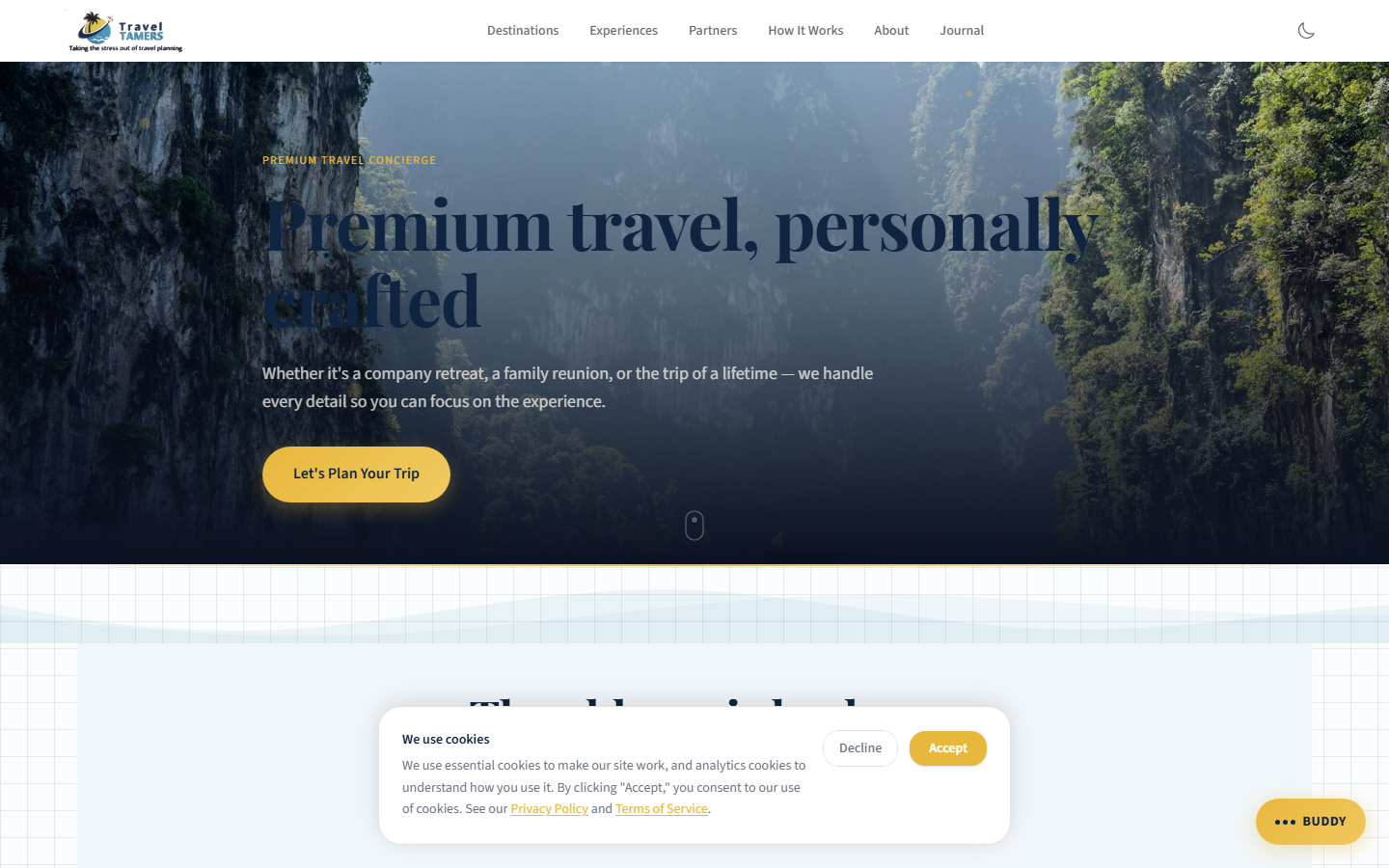
CTA Note: The primary CTA button "Let's Plan Your Trip" is designed to remain on a single line at desktop widths. On mobile and tablet, it may wrap to two lines — this is expected behavior and should be accounted for with adequate padding.
Animations
Animations use GSAP for scroll-triggered effects and CSS transitions for
micro-interactions. All animations respect prefers-reduced-motion — they are
disabled entirely when the user prefers reduced motion.
Easing Functions
| Token | Cubic Bezier | Usage |
|---|---|---|
ease-smooth | cubic-bezier(0.4, 0, 0.2, 1) | General purpose transitions |
ease-enter | cubic-bezier(0, 0, 0.2, 1) | Elements entering the viewport |
ease-exit | cubic-bezier(0.4, 0, 1, 1) | Elements leaving the viewport |
ease-power2-out | cubic-bezier(0.23, 1, 0.32, 1) | Matches GSAP Power2.out |
ease-power3-out | cubic-bezier(0.22, 1, 0.36, 1) | Matches GSAP Power3.out |
Duration Scale
| Token | Duration | Usage |
|---|---|---|
fast | 150ms | Button hover, focus rings |
normal | 250ms | Standard transitions |
slow | 400ms | Card reveals, panel slides |
slower | 600ms | Page transitions, hero animations |
GSAP Scroll Animations
Key animations triggered by ScrollTrigger as elements enter the viewport:
- fade-up: Translate Y from 20px to 0, opacity 0 to 1. Used on cards, text blocks.
- fade-in: Opacity 0 to 1 over 400ms. Used on images, decorative elements.
- slide-down: Translate Y from -10px to 0. Used on dropdown menus, notifications.
- slide-in-right: Translate X from 20px to 0. Used on staggered list items.
- underline-expand: Scale X from 0 to 1. Used on heading underlines and dividers.
- shimmer: Background position shift. Used on loading skeleton states.
- pulse-gentle: Opacity oscillation over 8s. Used on the Miles chat FAB.
- ember-pulse: Slow breathing glow animation. Used on Fire element warning cards.
- metal-shine: Specular sweep across Metal element surfaces on hover.
Hover Transitions
Hover: translateY(-3px) Hover: border glow Hover: shadow lift/* Standard card hover transition */
.card {
transition: all 0.3s cubic-bezier(0.4, 0, 0.2, 1);
}
.card:hover {
transform: translateY(-2px);
border-color: var(--abyss-400);
box-shadow: 0 8px 24px rgba(0, 0, 0, 0.3);
}
/* GSAP ScrollTrigger setup */
gsap.from('.fade-target', {
y: 20, opacity: 0, duration: 0.6,
ease: 'power2.out',
scrollTrigger: { trigger: '.fade-target', start: 'top 85%' }
});Dark/Light Section Alternation
Pages alternate between darker and lighter section backgrounds to create visual rhythm and prevent monotony. This is a core styling rule: contrast is your friend. Adjacent sections should never share the same background shade.
Abyss 800#0B1120 Abyss 600
#131B2E Abyss 800
#0B1120 Abyss 500
#1A2540
Light Mode Sections
Some pages incorporate light sections (parchment, tint-blue, warm-white) for contrast against
the dominant dark palette. Text in light sections uses navy (#0F2440) or
charcoal (#2D3436) instead of cloud.
Cloud text Parchment Section
Navy text Tint Blue Section
Navy text Dark Section
Cloud text
Rule of Thumb: Never place two identically-shaded sections back to back. Alternate between at least two different background values. For dark sections, cycle between
abyss-800,abyss-600, andabyss-500. For mixed pages, interleave dark and light sections for maximum visual impact.
Icons & Assets
The project uses different icon systems depending on the application context. Hero and destination imagery comes from curated Unsplash collections, optimized for the dark palette.
Icon Libraries
| App | Library | Usage |
|---|---|---|
| Marketing Site | Custom SVGs + inline SVG icons | Feature illustrations, decorative elements (lucide-react removed) |
| Nexus Ops Hub | Lucide React | UI icons (navigation, actions, status indicators) |
| Groups App | Bootstrap Icons | UI elements in EJS templates |
Photography Guidelines
- Source: Unsplash via
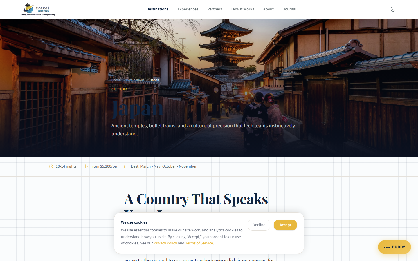
images.unsplash.com(allowed in CSP img-src). All photos are curated and color-graded for the dark palette. Incorrect or generic stock images have been replaced with destination-accurate photography across all affected pages (Alaska, Patagonia, AmaWaterways, Silversea, Virgin Voyages, Celebrity Cruises, Regent Seven Seas, expedition cruises, river cruises, and blog posts). - Treatment: Dark overlay (40-60% opacity) on hero images to maintain text readability
- Aspect ratios: Hero
21:9, Card16:10, Portrait3:4, Square1:1 - Optimization: WebP format with Astro's built-in image optimization pipeline
- Color grading: Desaturate slightly, boost shadows toward navy blue to match the palette
- SVG accessibility: Decorative SVGs (partner logos, icons) use
aria-hidden="true"
Z-Index Scale
Consistent layering prevents stacking conflicts across components. The Miles chat FAB is the only permitted floating UI element on the site — no sticky bars or additional floating elements are allowed.
| Token | Value | Usage |
|---|---|---|
z-behind | -1 | Background decorations |
z-base | 0 | Normal flow content |
z-above | 10 | Slightly elevated elements |
z-dropdown | 100 | Dropdown menus |
z-sticky | 200 | Sticky headers, sidebars |
z-nav | 300 | Main navigation bar |
z-overlay | 400 | Backdrop overlays |
z-modal | 500 | Modal dialogs |
z-cookie | 600 | Cookie consent banner |
z-tooltip | 700 | Tooltips, popovers |
z-miles | 9000 | Miles chat FAB (only floating element) |
Visual References
Placeholder slots for key screenshots demonstrating the Dark Sanctuary design system in practice.