Marketing Site
The public-facing website for Travel Tamers. Built with Astro 5 for static site generation and React 19 islands for interactive features like AI-powered travel chat and multi-step contact forms. Styled with Tailwind 4 using the Dark Sanctuary design system with an elemental design language across all card components.
Architecture Overview
The marketing site follows Astro's islands architecture pattern. Most pages are rendered to static HTML at build time, producing fast, zero-JavaScript pages by default. Interactive components (MilesChat, ContactForm, newsletter signup) are hydrated as React islands only where needed, keeping the overall JavaScript payload small.
Content is managed through Astro content collections with Markdown and MDX files for destinations, experiences, partners, and blog posts. Each collection has a typed schema, so content editors get validation errors before build if required fields are missing.
Key Principle: The site ships zero JavaScript for static pages. React only loads on pages that contain interactive islands (chat, forms, search). This keeps Lighthouse scores high and page load times under 1.5 seconds.
Tech Stack
| Layer | Technology | Role |
|---|---|---|
| Framework | Astro 5 | Static site generation, routing, content collections |
| UI Framework | React 19 | Interactive islands (MilesChat, ContactForm, etc.) |
| Styling | Tailwind 4 | Utility-first CSS with custom design tokens |
| Animations | GSAP | Scroll-triggered reveals, entrance animations |
| Search | Pagefind | Client-side full-text search across all pages |
| Typography | Self-hosted WOFF2 | Playfair Display (headings) + Source Sans 3 (body) — variable fonts, weight 400-700, font-display: swap. No external CDN dependencies. |
| Icons | Custom SVGs | Inline SVG elements throughout — no icon library dependency |
| Analytics | GA4 + GTM | Traffic analytics and tag management |
| Hosting | nginx (Docker) | Static file serving behind Traefik reverse proxy |
Directory Structure
site/
├── src/
│   ├── components/       # Astro + React components
│   │   ├── Nav.astro     # 3-way theme toggle (sun/moon/monitor icons)
│   │   ├── Footer.astro
│   │   ├── MilesChat.tsx
│   │   ├── ContactForm.tsx
│   │   └── ...
│   ├── content/          # Astro content collections
│   │   ├── destinations/
│   │   ├── experiences/
│   │   ├── partners/
│   │   └── blog/
│   ├── layouts/          # Page layout templates
│   │   └── BaseLayout.astro  # Flash-prevention script in <head>
│   ├── pages/            # File-based routing
│   └── styles/
│       └── global.css    # Design tokens (1000+ lines), dark mode overrides
├── public/
│   ├── fonts/            # Self-hosted WOFF2 (Playfair Display + Source Sans 3)
│   ├── images/           # Self-hosted partner, experience, and destination images
│   │   ├── partners/     # Partner hero images (all self-hosted)
│   │   └── experiences/  # Experience hero images (all self-hosted)
│   └── js/               # Extracted inline scripts
│       ├── dark-mode.js  # 3-way toggle (light/dark/system)
│       ├── analytics.js
│       ├── cookie-consent.js
│       ├── scroll-progress.js
│       └── buddy-config.js
├── astro.config.mjs
└── package.json
Pages & Routes
Astro uses file-based routing where each .astro file in src/pages/
becomes a URL. Dynamic routes use bracket syntax for content collection pages like
[slug].astro.
| Route | Page | Description |
|---|---|---|
/ |
Home | Hero section, destinations grid, experiences preview, partner logos, testimonials (generic fictional names/companies), CTA. "No ticket queues, no runaround" pain point copy. Proper <h3> heading hierarchy throughout. |
/destinations/ |
Destinations | Browse all travel destinations with filtering |
/destinations/[slug] |
Destination Detail | Rich detail page: country, region, visa info, safety, best time to visit |
/experiences/ |
Experiences | 3-column DestinationCard grid layout matching the destinations, partners, and blog listing pages |
/experiences/[slug] |
Experience Detail | Expedition cruises, river cruises, luxury resorts, eco-adventures, etc. |
/partners/ |
Partners | Browse travel vendor and supplier profiles with partner logos on each card |
/partners/[slug] |
Partner Detail | HX Expeditions, NatGeo, AmaWaterways, Ponant, etc. Each detail page includes the partner logo with per-partner logoScale sizing. |
/blog/ |
Blog | Travel articles listing with categories. Category filter shows a friendly empty state when no posts match. |
/blog/[slug] |
Blog Post | Individual article with rich formatting |
/about/ |
About | Company story, team bios (written with natural contractions), Nexion Travel Group affiliation |
/contact/ |
Contact | Multi-step contact form (React island) |
/how-it-works/ |
How It Works | Service process explanation for potential clients |
/las-vegas-golf/ |
Las Vegas Golf | Custom content page for Las Vegas golf packages |
/for/[slug] |
Proposal Pages | Company-specific proposal landing pages. Form submits to /webhooks/form-submit with honeypot field; payload sends name, source, companySlug. Page-view tracking hits /api/page-views. |
/eclipse/2027 |
Eclipse 2027 | Detailed packages for the August 2027 Eclipse of the Century |
/rss.xml |
RSS Feed | Atom/RSS feed of blog posts with autodiscovery link in <head> |
/404 |
Error | Custom 404 page with navigation suggestions |
Client Pages: All future client-specific pages go under
/for/only. The/clients/path is legacy. Current pages (sullivan, kelsey, titshaw, alaska-options) remain as-is until they move to booking, then get removed.
Content Collections
Astro content collections provide type-safe content management using Markdown/MDX files with
frontmatter schemas. Each collection is defined in src/content/config.ts with a
Zod schema that validates every content file at build time.
Collection
Destinations
Travel destinations with metadata like country, region, continent, visa requirements, safety level, currency, language, best months to visit, and self-hosted hero images.
Collection
Experiences
Travel experience categories: expedition cruises, river cruises, luxury resort stays,
eco-adventures, cultural immersions, and more. Each with description, highlights, pricing tiers,
and self-hosted hero images in /images/experiences/.
Collection
Partners
Vendor and supplier profiles with partner logos (9 logos, each with a logoScale
field for per-partner sizing), self-hosted hero images in /images/partners/,
featured itineraries, and commission structures. HX Expeditions, NatGeo, AmaWaterways, Ponant, etc.
Collection
Blog
Travel articles organized by category. Supports rich formatting with MDX components, embedded images, pull quotes, and related destination links. Category filter shows a friendly empty state when no posts match the selected filter.
Adding Content: Create a new
.mdor.mdxfile in the appropriatesrc/content/subdirectory. The frontmatter schema will validate your metadata at build time. If any required fields are missing, the build will fail with a clear error message.
Images & Assets
All hero images for partners and experiences are self-hosted in the public/images/
directory, eliminating runtime dependencies on external image CDNs. Destination pages use a mix
of self-hosted and curated Unsplash images, all color-graded for the dark palette.
Self-Hosted Image Directories
| Directory | Contents |
|---|---|
/images/partners/ |
Hero images for all partner detail pages — no Unsplash URL dependencies |
/images/experiences/ |
Hero images for all experience detail pages — no Unsplash URL dependencies |
/fonts/ |
Self-hosted WOFF2 variable fonts (Playfair Display + Source Sans 3) |
Partner Logos
Nine partner logos are displayed on both the partner listing cards and individual detail pages.
Each partner's content frontmatter includes a logoScale field that controls per-partner
logo sizing, ensuring logos of different aspect ratios appear visually balanced. Partner logo SVGs
use aria-hidden="true" since they are decorative.
Image Treatments
All hero and card images use the .img-cinematic class, which applies a slight
desaturation (saturate(0.88)) and contrast boost (contrast(1.08))
to create a cohesive, editorial look across images from different sources. Featured images
also use a Ken Burns effect — a slow 8-second zoom animation that gives
static images a sense of depth and movement on hover or when in view.
Interactive Components (React Islands)
While most of the site is static HTML, several components require client-side interactivity.
These are built as React 19 components and hydrated using Astro's
client:* directives. Each island loads its JavaScript independently, so a user
viewing a static destinations page downloads zero React code.
| Component | Hydration | Purpose |
|---|---|---|
| MilesChat | client:idle |
AI travel advisor widget (Claude Sonnet powered) |
| ContactForm | client:visible |
Multi-step form with validation and API submission. Full dark mode support. role="alert" on error messages. |
| Newsletter | client:visible |
Email signup in the footer. Uses variant="dark" prop for cloud-white text on navy background. Uses res.ok check, aria-label, role="status"/role="alert" for feedback. |
| OnboardingForm | client:visible |
Client onboarding multi-step form. Full dark mode support. 35+ htmlFor/id pairs, responsive grids, progress bar with role="progressbar", autocomplete attributes. |
| Accordion | client:visible |
Collapsible FAQ/content sections. Full dark mode support. |
| Dark Mode Toggle | Vanilla JS | 3-way toggle (light/dark/system) with sun/moon/monitor icons in Nav.astro. Reads tt_theme from localStorage. prefers-color-scheme listener for system mode. |
| Cookie Consent | Vanilla JS | GDPR-style consent banner |
| Scroll Progress | Vanilla JS | Reading progress bar at top of page |
Hydration Strategy:
client:idleloads after the page finishes initial rendering, ideal for non-critical interactive elements like chat.client:visiblewaits until the component scrolls into view, perfect for below-the-fold forms. Several small behaviors (dark mode, cookies, scroll progress) use vanilla JS extracted topublic/js/to avoid loading React entirely.
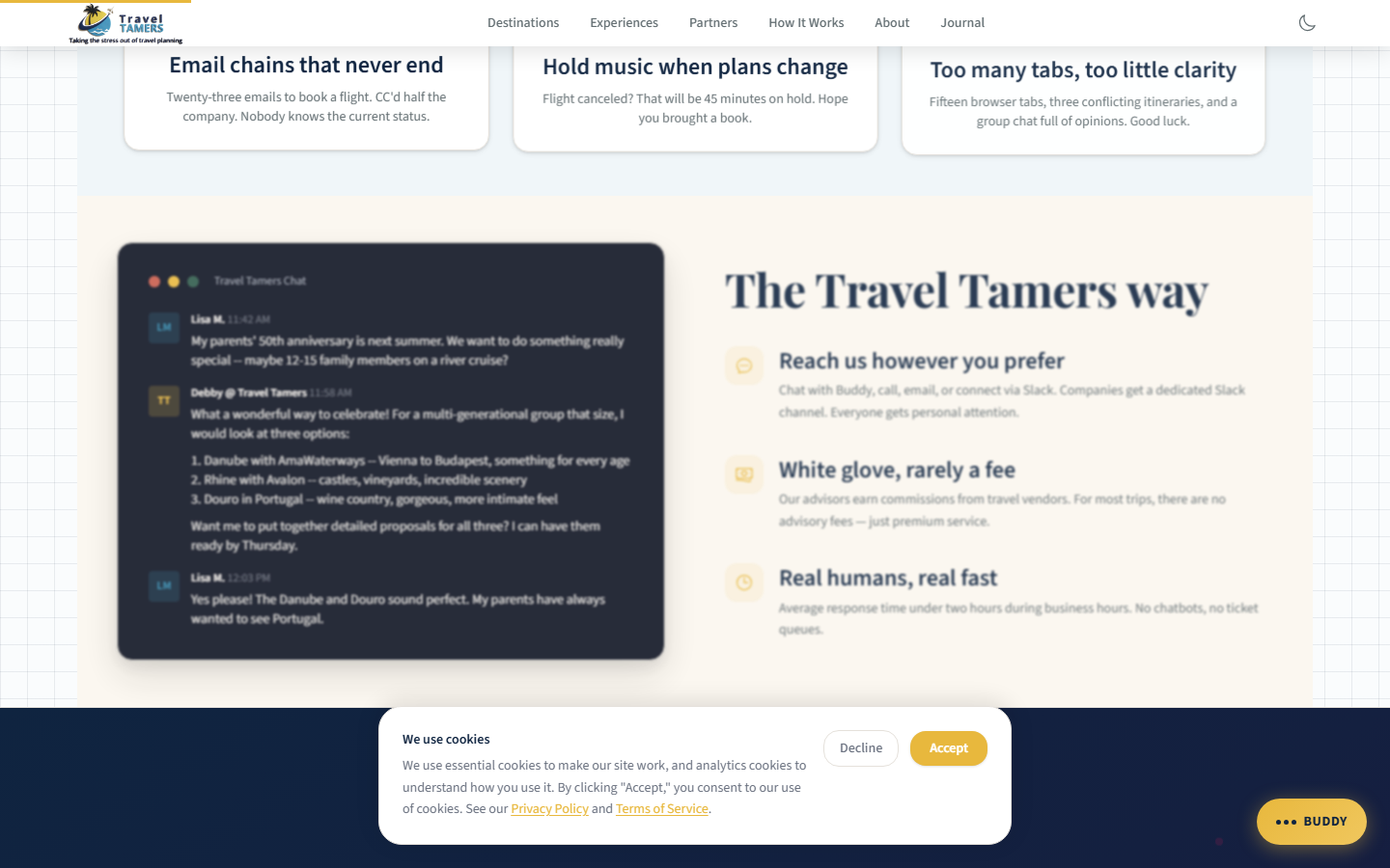
MilesChat Widget
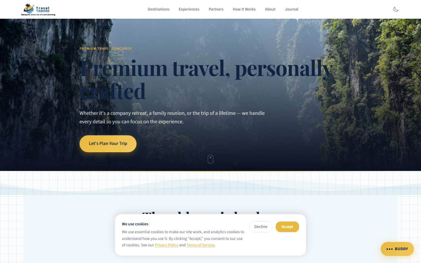
MilesChat is the AI-powered travel advisor that appears as a floating action button (FAB)
in the bottom-right corner of every page. The FAB is styled as a gold glass speech
bubble with a triangular tail created via ::before and ::after
pseudo-elements, using backdrop-filter: blur() for the glass effect. The button
text is responsive: "Miles" on mobile, "Chat with Miles" on
desktop. When clicked, it opens a modal chat interface where visitors can ask travel questions
and get personalized recommendations.
How It Works
Visitor clicks the gold speech-bubble FAB
The FAB is fixed to the bottom-right corner with a gold glass finish and triangular tail. Text reads "Miles" on mobile viewports or "Chat with Miles" on larger screens.
Chat modal opens with greeting
The modal presents a conversational interface with the greeting: "Hey there — I'm Miles, your travel concierge." The modal has role="dialog", aria-modal="true", aria-live on the message area, a focus trap, and Escape key to close.
Messages sent to the API
User messages are sent to the Hono API, which forwards them to Claude Sonnet with a system prompt containing Travel Tamers context.
Claude Sonnet via API
AI responds with travel advice
Responses are streamed back to the chat interface. Responses are capped at 250 tokens for concise answers. Scrolling uses offsetTop for reliability.
Can auto-fill and submit contact form
If the conversation leads to a booking inquiry, MilesChat can programmatically fill in the contact form with information gathered during the chat and submit it.
Creates contact + deal + Slack channel
Accessibility
role="dialog"andaria-modal="true"on the chat modalaria-liveregion on the message container for screen reader announcements- Focus trap keeps keyboard navigation inside the open modal
- Escape key closes the modal
- iOS zoom fix:
font-size: max(.92rem, 16px)on inputs prevents unwanted zoom on focus
Rate Limiting: MilesChat is rate limited to 20 requests per minute per IP address to prevent abuse. The rate limit is enforced at the API layer. Users who exceed the limit receive a friendly message asking them to slow down. HTML in user messages is escaped to prevent XSS.
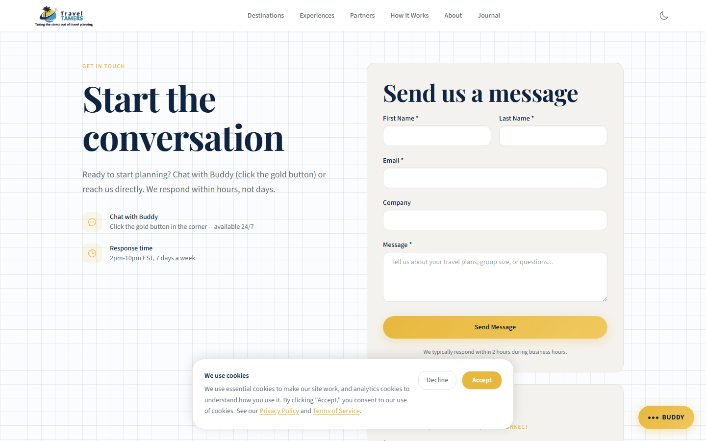
Contact Form
The contact form is a multi-step React component that collects visitor information and travel preferences. On submission, it triggers a chain of actions through the API that creates the initial records needed to begin the sales process.
Submission Pipeline
Form validated client-side
React handles field validation with clear error messages before allowing submission.
POST to Hono API
Data sent to /webhooks/form-submit with Zod validation on the server side. A honeypot field detects bot submissions. Payload includes name, source, and companySlug.
Contact record created
A new contact is inserted into tt_fresh_db with all form fields.
Deal record created
An associated deal is created in the sales pipeline for tracking.
Slack channel created
A dedicated Slack channel is spun up for this client, and the team is notified in #sales-alerts.
Slack Bot API
Design System
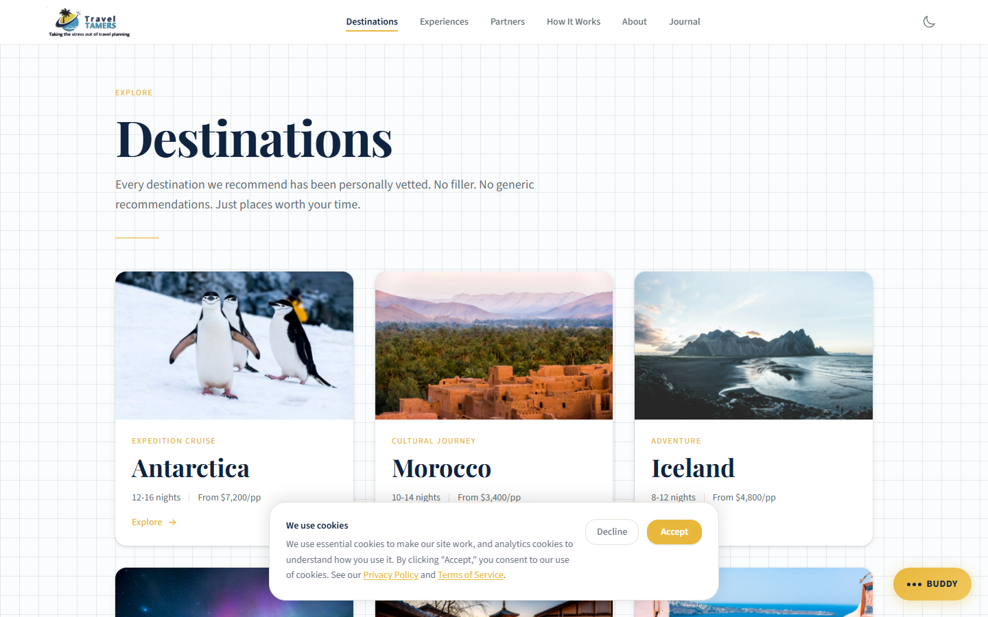
The site implements the Dark Sanctuary design system, a premium aesthetic built around dark navy backgrounds, warm off-white text, and gold accents. The system follows a 60-30-10 color distribution rule: 60% dark backgrounds, 30% text and surfaces, 10% gold highlights.
Elemental Design Language
Card components across the site use an elemental design system that maps natural materials to visual effects. This creates a tactile, layered feel across all card surfaces:
- Paper grain: Subtle texture applied to card backgrounds for organic warmth
- Water underglow: Soft blue luminance beneath interactive card elements
- Metal borders: Metallic-toned border treatments on card edges
- Fire advisory: CSS classes for attention-drawing highlight states on cards (urgent CTAs, limited availability)
Core Palette
| Token | Value | Usage |
|---|---|---|
| Abyss / Navy | #0B1120 |
Primary background, page base color |
| Cloud / Off-White | #F0EDE8 |
Primary text, headings |
| Gold | #E8B83D |
Accents, CTAs, highlights, links |
| Mist | #9CA3AF |
Secondary text, metadata, captions |
| Danger | #A85454 |
Error states, warnings |
| Success | #3A7460 |
Confirmation, positive states |
| Parchment | #F4F2EE |
Light section backgrounds (alternating layers) |
| Tint Blue | #F0F6F9 |
Light info backgrounds |
Typography
Playfair Display is used for all headings (h1 through h3), providing an editorial,
premium feel. Source Sans 3 handles body text, UI labels, and everything else, chosen
for its excellent legibility at small sizes on screens. Both fonts are self-hosted as variable WOFF2
files (weight range 400-700) in public/fonts/ with font-display: swap,
eliminating external CDN dependencies. No Google Fonts <link> tags are used.
Graph Paper Background
A distinctive visual treatment used on several sections: a dual-grid background effect that creates
the appearance of graph paper. The minor grid is 28px and the major grid is 112px, layered with a
radial vignette for depth. The background uses background-attachment: fixed so the grid
stays stationary while content scrolls over it.
Prose Content Rendering
Markdown content rendered via Astro's content collections uses Tailwind's prose class
for typographic formatting. The prose-invert variant is only applied on pages with
dark backgrounds. Pages with light backgrounds (parchment, white) — including
/eclipse/2027, /destinations/[slug], /experiences/[slug],
and /partners/[slug] — use the standard prose class to ensure
readable dark-on-light text.
Styling Rule: Alternating Layers
Contrast is your friend. Adjacent sections should alternate between lighter and darker backgrounds. On dark pages, alternate between
#0B1120and#0F1625. CTA buttons on dark backgrounds get a 1px#F0EDE8border; on light backgrounds, a 1px#0F2440border.
Card Components
The site uses a family of card components across different content types. All cards share the
unified card-depth system, which provides consistent border, shadow, and hover
behavior with the elemental design language (paper grain, water underglow, metal borders).
Clickable cards include focus-visible rings for keyboard navigation.
Component
DestinationCard
Featured image with cinematic treatment, destination name, country, and a brief tagline. Hover reveals a gold border accent. Links to the full destination detail page. Also used as the layout component on the experiences listing page (3-column grid).
Component
ExperienceCard
Category icon, experience type name, description snippet, and starting price. Used on the homepage grid. The experiences listing page uses DestinationCard in a 3-column grid for visual consistency across listing pages.
Component
PartnerCard
Partner logo (with per-partner logoScale sizing), company name, specialties,
and a featured itinerary preview. Nine partner logos displayed on cards and detail pages.
Used on the partners listing and the homepage partner strip.
Component
BlogPostCard
Cover image, title, category badge, publication date, and reading time. Used on the blog listing and related posts sections.
Component
TestimonialCard
Client quote with attribution using generic fictional names and companies (David Harmon / Ridgepoint Solutions, Rachel Simmons / Canopy Group, Brian Kessler / Waymark Partners). Displayed in a horizontally scrolling carousel on the homepage. Quotes are toned-down and pulled from content data rather than hardcoded.
Component
FeatureCard
Icon + title + description layout for feature highlights on the homepage. Hover effect removed (was a false affordance since the card is not clickable).
Component
StatCard
Animated stat number with label. Glass effect removed to prevent double shadow artifacts with the card-depth system.
Animations & Effects
GSAP Scroll Reveals
Content sections use GSAP's ScrollTrigger plugin for entrance animations. Elements fade in and translate upward as they enter the viewport. The animations are subtle (20-30px movement, 0.6s duration) to feel polished without being distracting.
Dark Mode: 3-Way Theme Toggle
The site implements a 3-way theme toggle (light / dark / system) in
Nav.astro using sun, moon, and monitor icons. The selected preference is stored
in localStorage under the key tt_theme. A flash-prevention script in
BaseLayout.astro's <head> reads this value before first paint
and applies the html.dark class immediately, preventing any flash of wrong theme.
The dark-mode.js script handles the 3-way model: when set to
"system", it listens on prefers-color-scheme and responds to OS-level changes
in real time.
Token Overrides for Dark Mode
Tailwind 4 custom classes (e.g., .text-navy, .bg-white) are not
covered by Tailwind's built-in dark: variants because they are defined as custom
utilities in @theme. To handle this, 25+ token overrides in global.css
flip these classes under html.dark, covering 2,000+ class instances across the site:
- Text overrides:
.text-navy,.text-charcoal,.text-warm-gray,.hover\:text-navy, plus arbitrary hex text colors (#2D3436,#374151,#4B5563,#1F2937) - Background overrides:
.bg-white→#131B2E,.bg-parchment→#151D30,.bg-tint-blue,.bg-white/90,.bg-sky-50,.bg-gold-50, plus arbitrary hex backgrounds (#F4F2EE,#ffffff,#F0F6F9) - Gradient overrides:
.from-white,.to-white,.from-[#F0EDE8],.to-transparent - Border/divider overrides:
.border-light-border,.bg-light-border,.divide-[#E5E1DB],.border-parchment-border,.border-tint-blue-border - Gold/accent overrides: Gold text, border, and background hex values preserved; hover states maintained
Dark mode coverage extends to all React islands (ContactForm, OnboardingForm, NewsletterSignup,
Accordion), Pagefind search UI, and the cookie consent banner (explicit dark: classes
on text elements). The btn-secondary class has safety overrides on .bg-abyss-600
and .bg-abyss-800 sections to ensure visibility. Font-serif text-stroke effects are
disabled in dark mode to avoid rendering artifacts.
SEO & Analytics
Google Tag Manager & GA4
| Service | ID | Notes |
|---|---|---|
| GTM Container | GTM-5L5JMXHF |
Manages all tracking tags |
| GA4 Property | G-TCM7G30PJC |
Traffic and event analytics |
Pagefind Search
Pagefind generates a client-side search index at build time, indexing all pages and content collection entries. Visitors can search across destinations, experiences, blog posts, and general pages without any server-side infrastructure. The search index is small (typically under 100KB) and loads on demand. The Pagefind UI is styled for the Dark Sanctuary palette in both light and dark modes, with custom input, result, and highlight colors matching the site's design tokens.
RSS Feed
The site publishes an RSS feed at /rss.xml containing all blog posts.
An autodiscovery <link> tag is included in the <head>
of every page via BaseLayout.astro, so RSS readers automatically detect the feed.
Sitemap
Astro's sitemap plugin automatically generates sitemap.xml at build time,
including all static pages and content collection entries. This is submitted to Google Search
Console for indexing.
Content Security Policy
The site enforces a Content Security Policy via nginx headers. The policy allows:
- Scripts:
'self','unsafe-inline'(required for GTM and dark-mode prevention), GTM and GA4 domains - Images:
'self',images.unsplash.com(remaining destination images),data:URIs - Styles:
'self','unsafe-inline' - Fonts:
'self'(self-hosted WOFF2, no external CDN) - Connect:
'self',api.traveltamers.com, GA4 endpoints
The 'unsafe-inline' for scripts is a concession for GTM compatibility and dark-mode
flash prevention. Inline scripts that could be extracted have been moved to public/js/.
Build & Development
Commands
# From the site/ directory:

npm run dev      # Start Astro dev server (port 4321, hot reload)
npm run build    # Build static output to dist/
npm run preview  # Serve the built site locally for testing
Development Notes
- The dev server runs on port 4321 with hot module replacement.
- Content collection changes (new .md files, frontmatter edits) trigger automatic rebuilds.
- React islands hot-reload independently without full page refresh.
- Tailwind 4 uses the new CSS-first configuration in
global.csswith a@themeblock containing all custom design tokens. - All external services are optional in dev — when API keys are absent, features log to console instead of failing.
Key Files
| File | Purpose |
|---|---|
astro.config.mjs |
Astro configuration: integrations, output mode, site URL |
src/styles/global.css |
All design tokens, Tailwind theme overrides (1000+ lines) |
src/content/config.ts |
Content collection schemas (Zod validation for frontmatter) |
src/components/Nav.astro |
Main navigation with CTA button and 3-way theme toggle (sun/moon/monitor icons) |
public/js/tt-widget.js |
MilesChat FAB widget script (gold glass speech bubble) |
public/js/dark-mode.js |
3-way dark mode toggle (light/dark/system) with prefers-color-scheme listener |
Deployment
The marketing site is deployed as static files served by nginx inside a Docker container, sitting behind the Traefik reverse proxy. The deployment pipeline is fully automated through GitHub Actions.
Deployment Pipeline
GitHub Actions triggered
Push to main branch or manual dispatch starts the deploy workflow.
GitHub Actions
Astro build runs
npm run build generates static HTML, CSS, JS, and Pagefind search index into dist/.
Astro SSG
Files transferred via SCP
The built dist/ directory is copied to the VPS at /opt/tt-fresh/.
SCP over SSH
Directory swap
The old site directory is renamed (kept as rollback), and the new build is moved into place.
Health check
An HTTP request verifies the site is responding correctly. On failure, the previous version is restored automatically.
Production Infrastructure
# Docker container: tt-fresh (nginx)
# Serves: traveltamers.com
# Traefik labels handle:
#   - SSL termination (Let's Encrypt)
#   - HTTP → HTTPS redirect
#   - CSP and security headers
#   - Rate limiting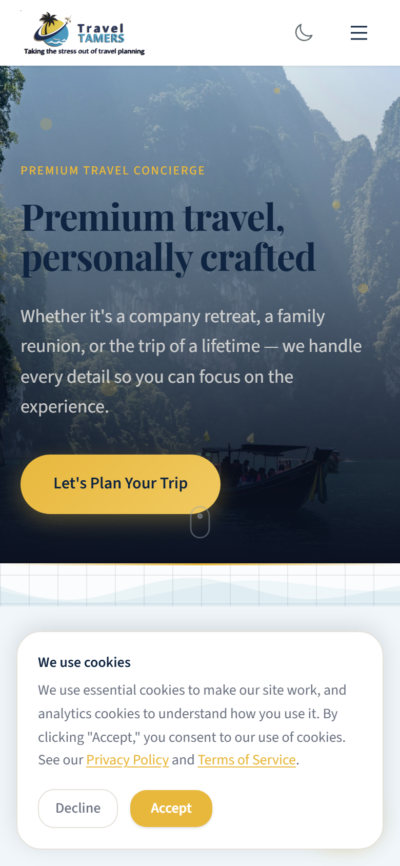
Rollback Safety: Each deployment keeps the previous build. If the health check fails after a deploy, the pipeline automatically swaps back to the previous version within seconds. Manual rollback is also available by SSH-ing to the VPS and renaming directories.